If you’re thinking of an opportunity to dabble with advertising, you can invest in a printing franchise. You can make smaller printouts for use as flyers, brochures, or pamphlets. Or you can scale it up and print out larger stuff such as posters and banners. Both are effective ways to catch the attention of curious onlookers.
Speaking of catching attention, this is the main purpose of signage. Outside of printed products, there are other ways to create signage. It also comes in different shapes and forms.
The Third Dimension
Posters and huge billboards are common. They feature images or text placed on a flat surface. What they show is often very detailed and could be hard to replicate as a sculpture or 3-D object. They are easy to replace, though, as they are often printed on materials that are light and disposable.
Signage can literally pop out if it is made under the conditions of three dimensions. You can make something that is not only nice to look at but to touch as well. Letters that you used to just read on paper can now be felt, enabling you to feel its edges and curves. If your brand has an object in its logo, it can be brought to life. It will not just be a visual element, but it will also have a physical presence.
Different materials can be used to make three-dimensional signage. You can go with acrylic or fiberglass if you are going with bright colors. These are usually used to attract people and installed in places such as restaurants and shopping malls. Metallic sculptures give a monolithic look. This fits well in an office’s reception area. It firmly establishes the name of the company and can make employees feel a sense of prestige when looking at it.
Light It Up

Proper lighting makes your signage look like a beacon in the night. Acrylic signs let light through and make logos glow. They still give out an inviting atmosphere. It makes an establishment still look lively in the middle of the night. Opaque materials have lighting behind them, showing the sign’s silhouette. Its shadows further highlight their physicality. Signage placed at the top of structures is given a towering effect.
Do not count neon lights out. They can still create attractive signage. They have a certain type of glow that exudes warmth. The bends and curves of neon signs are what makes them iconic. There’s a level of skill and artistry in making one.
Along Your Path
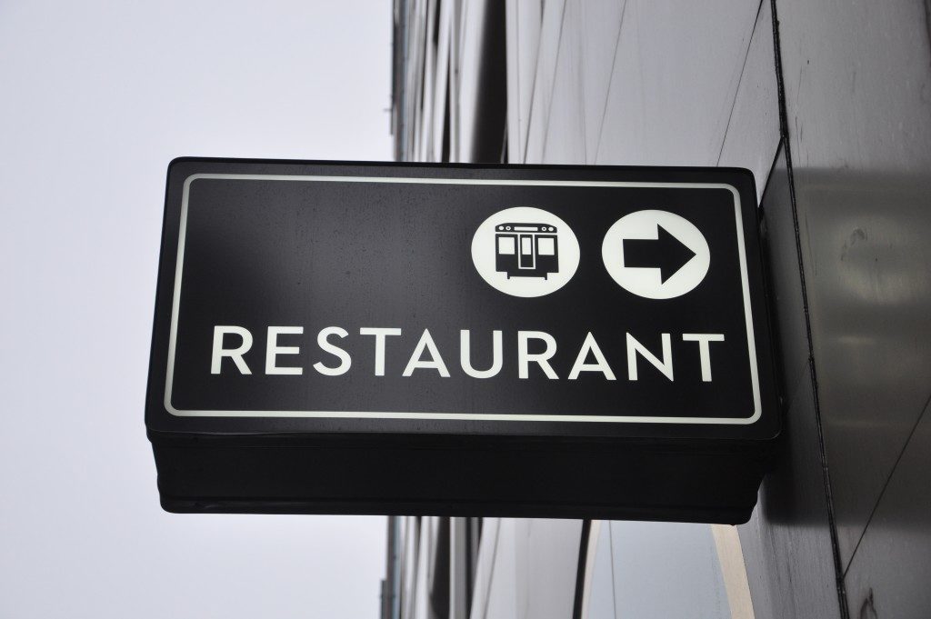
There are those smaller signs made to lead you somewhere. These can be put on little stands or placed on posts. They are strategically placed so that your eyes can’t avoid them. They can get your attention and make you curious about where they will take you. Along the streets, you see them indicating how far you are from an establishment. In malls, these can be scattered around with arrows telling you where to go.
Signage showcases creativity and smart marketing. If you create one that is truly eye-catching, you’ve done a great deal of work in getting your brand recognized. You should be on your way to success if you play your other cards right.

